Here i'm just having a look at how some of my favorite musical artists brand themselves
It's interesting how music of the Industrial/nu metal scene have logos that in some way have a futuristic look to them, be it through the use of type or the use of a logo. For example, 'Korn' have become iconic and instantly recogniseable thanks to the very simple but extremely effective use of using a revered and capitalized letter 'R'.
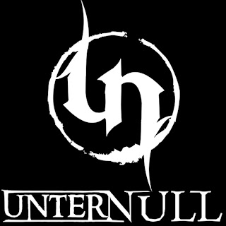
Industrial music like Unter Null have also incorporated the first letters of each word 'Unter' and 'Null' to create a fluid, futuristic and eye catching logo. The logo seems stylized in the manner of a warning, especially the types likely seen around chemical plants. The logo looks like a biohazard warning of some kind. It's edgy and very attractive to the Industrial music scene as well as being rebellious and perhaps a warning or a way of alerting people to the fact that Unter Null's music has something drastically different to offer and there's almost a thrill that comes with listening to music that is so dark and edgy as her's.


No comments:
Post a Comment